Sanaburi Magazine
Art Direction, Visual Identity, Brand Collaterals
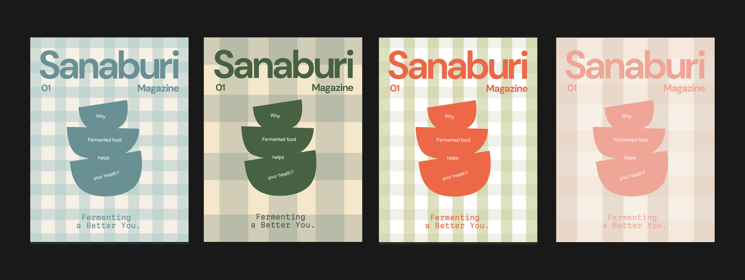
Client: Sanaburi Magazine
Creative Director: Mao Soma
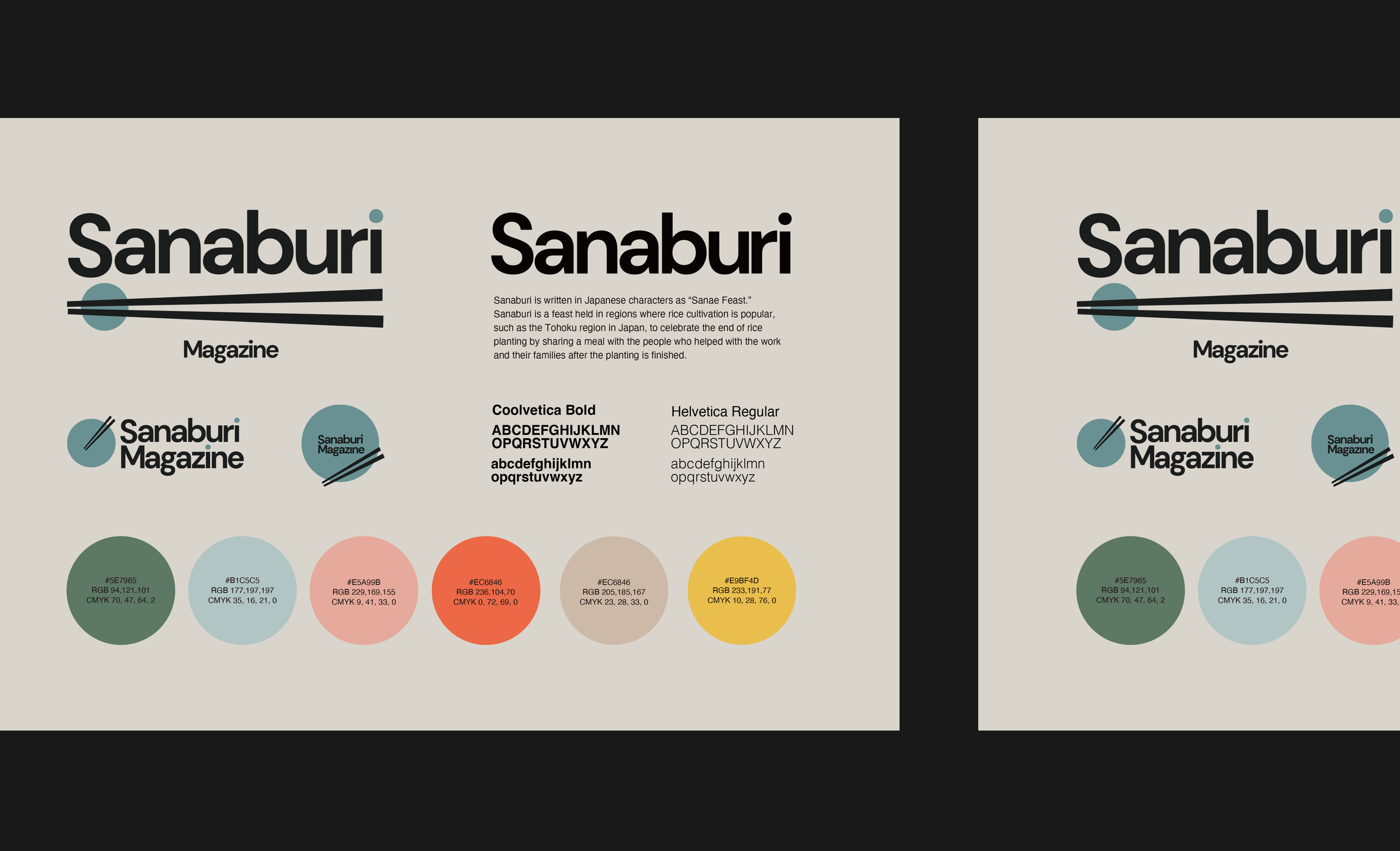
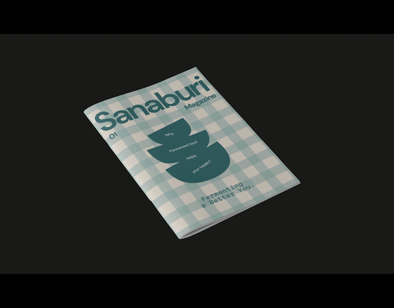
I was in charge of the visual identity and collateral design for Sanaburi Magazine, a free publication distributed at farmers markets across California. Aimed at food-conscious individuals, the magazine introduces the health benefits of Japanese cuisine in an accessible and engaging way.
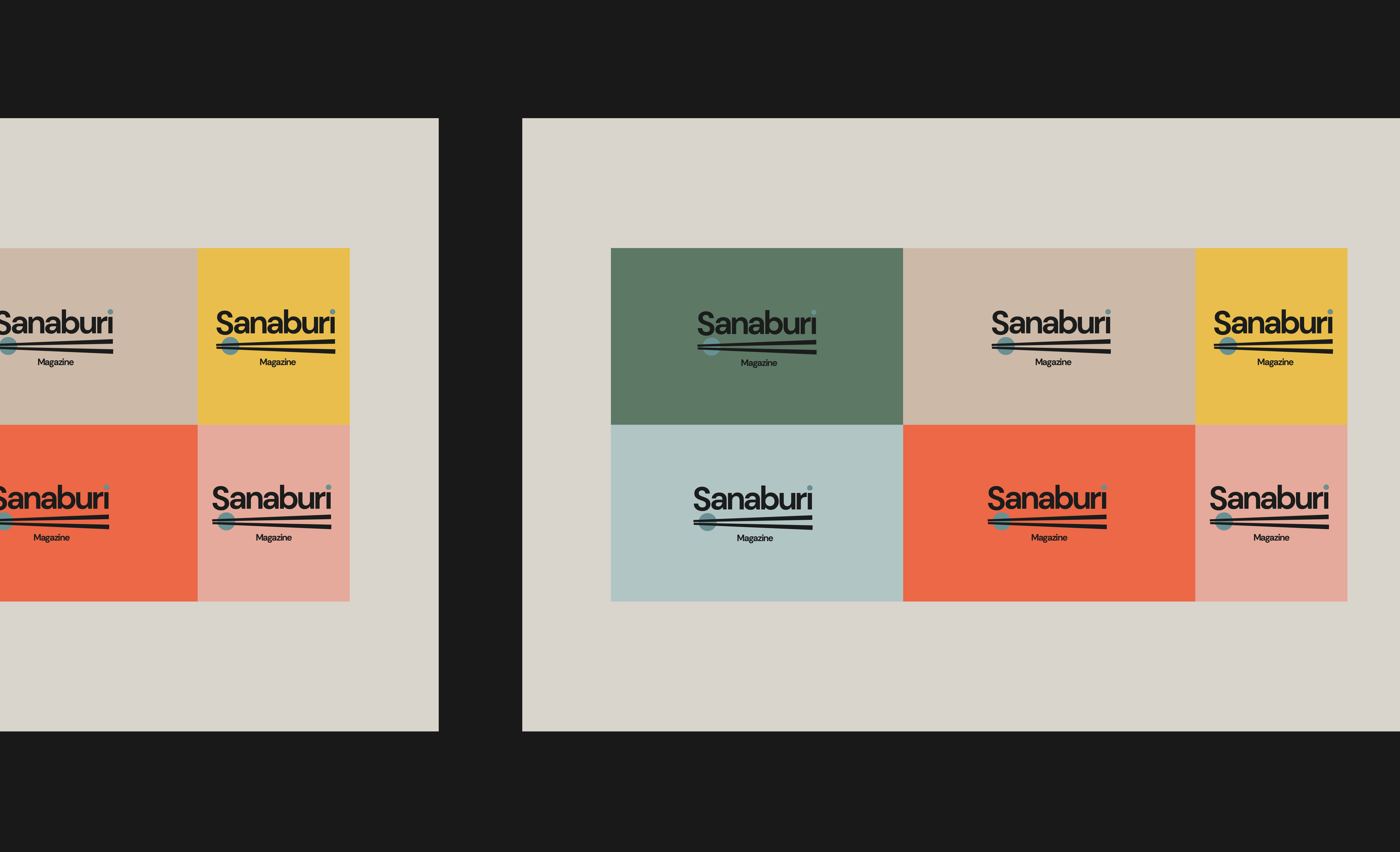
Inspired by the vibrant colors of fresh, nutrient-rich vegetables found at farmers markets, I developed a rich and colorful palette that evokes vitality and freshness. This visual direction was intended not only to reflect the essence of healthy eating, but also to capture the attention of passersby in a lively market setting.
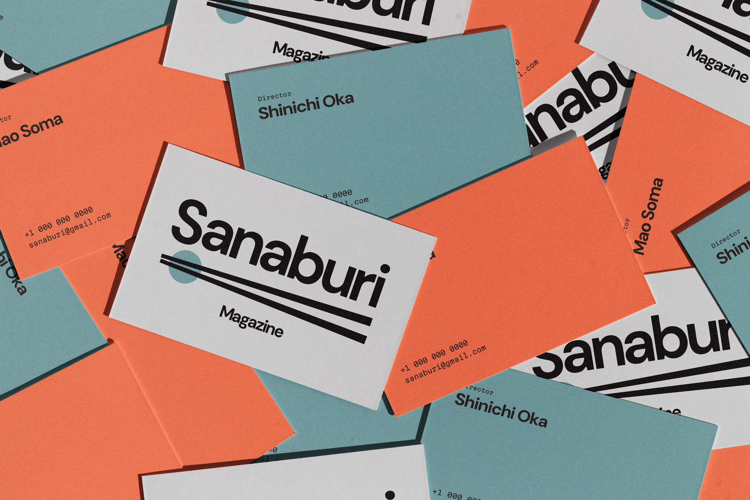
The client’s strong desire was for readers to genuinely engage with the content, not just pick it up and glance through. To support this, I crafted a bold and approachable design that invites curiosity and encourages deeper reading. Through thoughtful use of color, layout, and typography, the final design aligns with both the magazine’s mission and the dynamic environment in which it lives.
カリフォルニア各地のファーマーズマーケットで配布されている『Sanaburi Magazine』のビジュアルアイデンティティとコラテラルデザインを担当しました。
本マガジンは、食への関心が高い読者に向けて、日本食の持つ健康的な魅力を伝えることを目的としています。
ファーマーズマーケットという配布環境に合わせ、栄養豊富で彩り豊かな野菜からインスピレーションを得た多色使いのカラーパレットを採用。自然の恵みを感じさせる鮮やかなビジュアルで、訪れる人の目に留まりやすく、手に取りたくなるような誌面を目指しました。マガジン主宰側からは「読者にしっかりと読んでもらいたい」という強い想いがあり、その意図をデザインでどう表現するかが鍵でした。そこで、視認性と親しみやすさを両立させたタイポグラフィとレイアウト構成を用い、雑誌の中身への興味を自然に引き出せるよう工夫しています。
食・健康・文化を結ぶ本プロジェクトにおいて、デザインの力で読者とコンテンツをつなぐ橋渡しができたと感じています。